grind*set
clarity in your cup — brew tracking app
Lead Designer, Thinkful UX/UI program
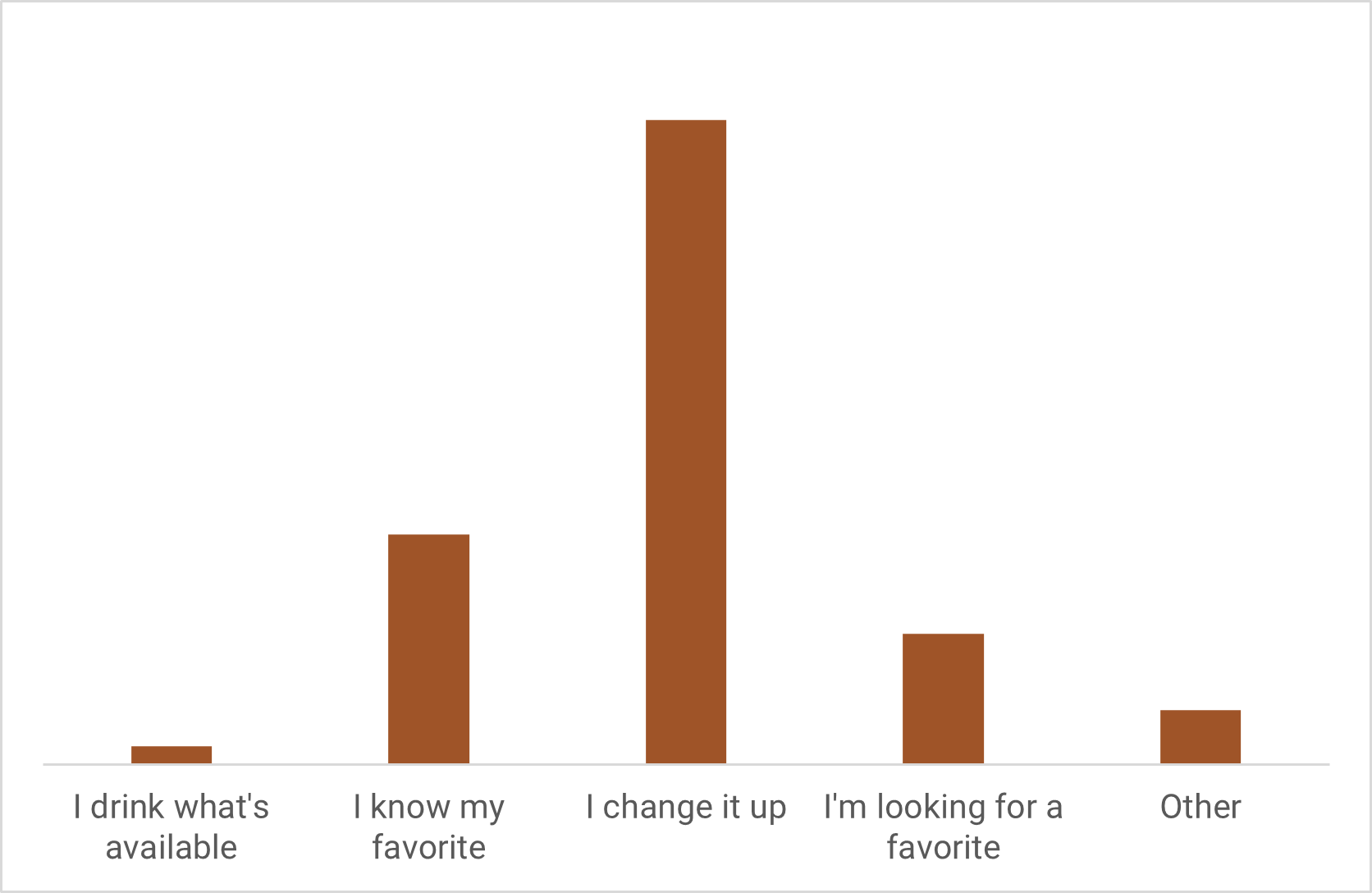
60.3% change it up often
65.8% track brews
key skills: User Research, balancing several User Stories
problem: it’s hard to dial in
For coffee drinkers who constantly dial in new beans, there’s no easy, comprehensive way to track and make the most of their data.
solution: intelligent entry and insights
I designed a brew tracking app that’s intuitive and modular — and makes intelligent recommendations for what you care most about.
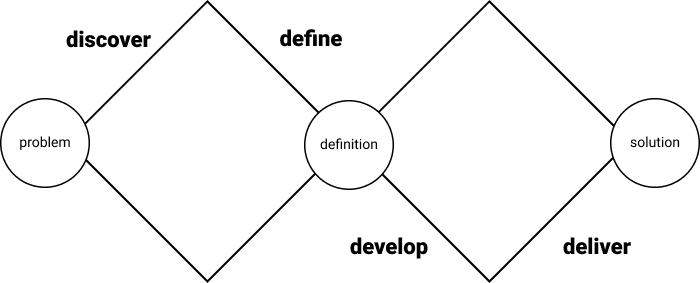
double diamond process
My process included four “D” phases: discover, define, develop and deliver. The process is iterative; learnings at every stage informed each round of changes to my design.
discover
methods
I started from my own love of coffee. I did extensive research to find a coffee problem I could solve, including:
Survey (239 participants)
User interviews (10 participants)
Extensive competitive analysis
survey
What kind of coffee do you drink?
What’s your relationship to coffee?
How do you get your coffee?
Grocery store 18.5%
Local shop 54.1%
Online from roaster 65.9%
By subscription 18.5%
I roast it myself 7.4%
(multiple selection available)
priorities, in order of importance
Roast level
Flavor notes
Process
Origin
Cost
Blend
user interviews
key findings
Logging can be extremely manual
Dislike feeling “sold to” or that recommendations aren’t trustworthy
Need to be able to tweak variables on the fly — dislike being tied to recipes
key pain points
Users value simplicity, flexibility and explorability
They’re passionate, but specialized - flexibility will be key
Primary desires: easy-to-use tracking, good recommendations
competitive analysis
direct and indirect competitors
Because I’m targeting a niche audience, I did a wider analysis of two types of competitor:
Direct competitors (coffee-related):
Indirect competitors (filling other niches):
three major opportunities
Create a wholistic, detailed logging experience for several types of tracker
Connect as much data as we can to minimize cognitive load
Make the most of data to give trustworthy recommendations
define
methods
Thanks to my extensive interviews, I had a good sense of empathy for my target user, but I needed to clearly outline my requirements.
I created:
Proto personas
Requirements outline
proto personas
The Simplicist
I can’t be bothered with fine details.
The Technician
I want to perfect every variable.
The Explorer
Must! Try! New! Things!
requirements
Logging that:
Takes you right to a search field
Pulls in information by default
Suggests flavor note tags based on you and others
Central bean pages with:
Details, ratings, flavor notes
Ability to log right from the page
develop
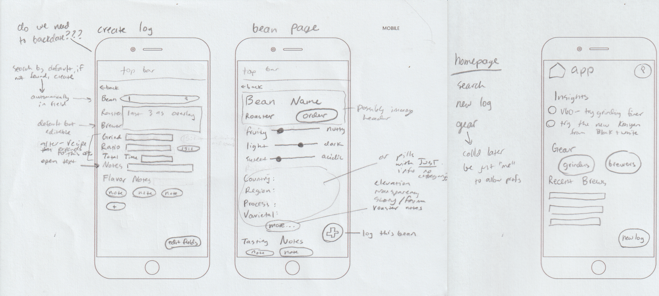
From the user flow I created screen sketches, then turned them into wireframes.
user stories, user flow
From my requirements and proto personas, I identified two required user stories and three specialized ones:
As a user, I need to quickly log different brews.
As a user, I need to save my gear, notes and stats.
As a technician, I need to log brew variables and get suggestions to tweak my method.
As an explorer, I need to log flavor notes and discover new beans to try.
As a simplicist, I need to minimize the time I spend logging.
Since I’m designing for many use cases, the user flow is quite vertical and has very few yes/no decisions — I instead focus on the flexibility to navigate between pages fluidly.
sketches
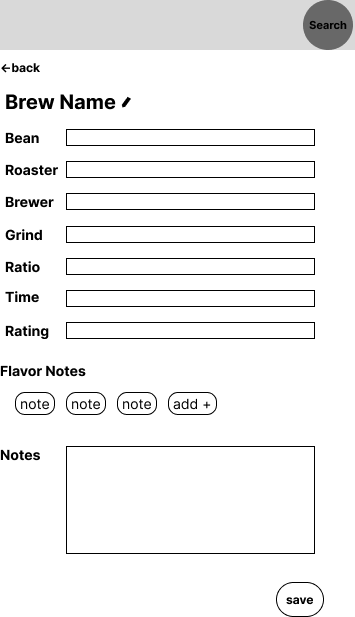
wireframes
branding and visual design
I prioritized lightness and brightness — qualities of morning and a good cup of coffee. I chose rounded elements that feel minimal and playful. I used all lowercase and friendly language, warm and friendly like a morning cup.
The palette uses colors from throughout the coffee lifecycle — green and tan unroasted beans, brown roasted beans and two reds representing the vibrant coffee cherry.
Lastly, a minimalist coffee bean logo incorporates into the elements of the app and would also work well on merchandising and signage.
deliver
user testing
I applied my branding and visual design to my prototype and ran usability testing for completion of four tasks:
Log a brew
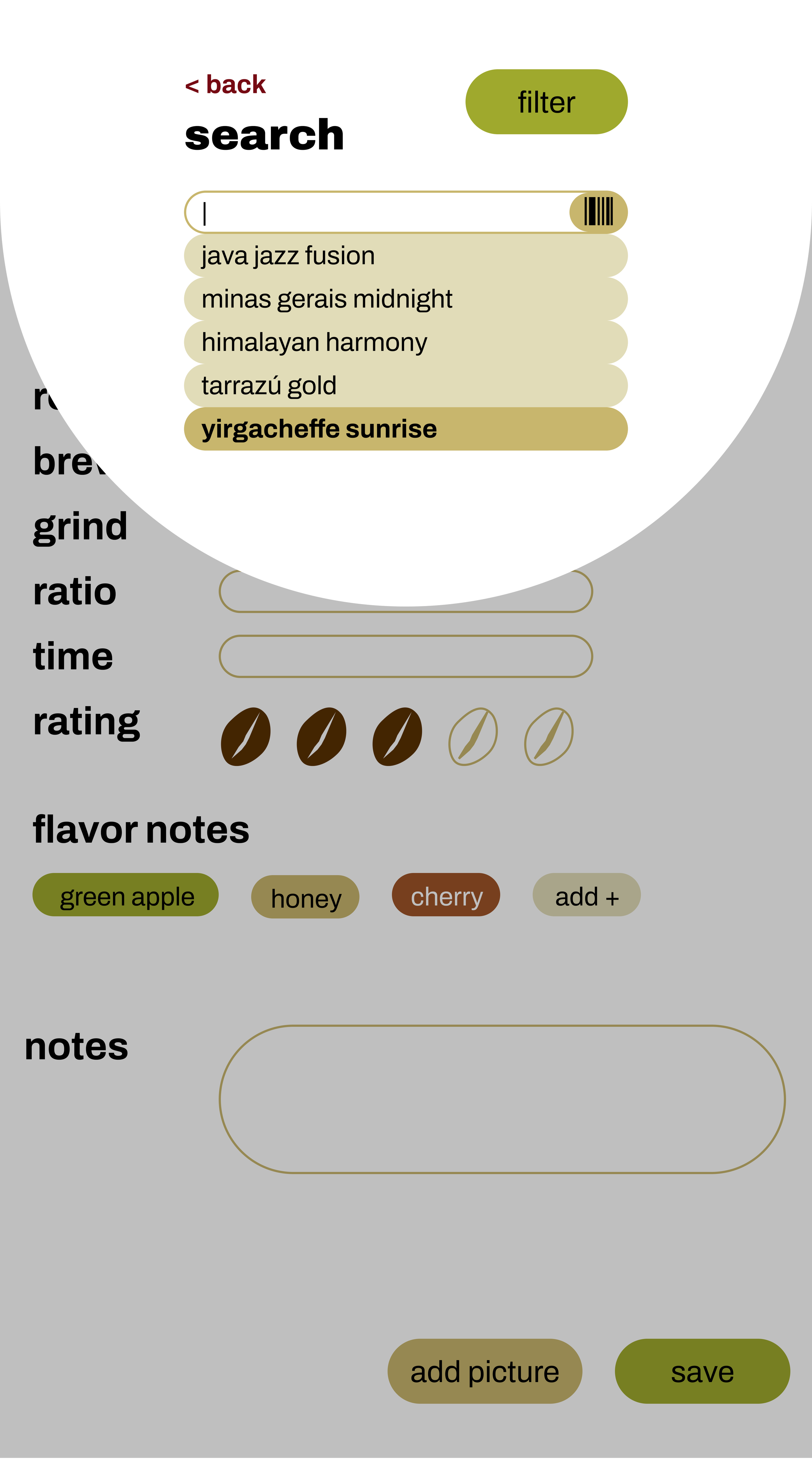
Search for a bean
Review past brews
Modify settings or gear
Testers had a 100% success rate for both tasks, but I made one major adjustment based on their feedback:
Rethink the home page: users typically place their phone on the counter to brew, so desirable elements should be centered rather than in thumb’s reach. Further, insights didn’t seem to warrant such prominent placement and could feel less “salesy” if the user needs to explore a little to find them.
final prototype
Check out the clickable prototype for yourself or explore these screenshots:
I definitely learned the value of research with this project. My extensive survey responses and user interviews gave me detailed feel for what’s expected, lacking, and desired in this space. This helped me identify creative ways to build what I feel is a truly delightful final product.
future recommendations:
Conduct more user testing to corroborate or contest my findings
Dark mode could relax user eyes before their morning cup
Brew log could become even more detailed — timer tool overlay, tracking of pour numbers, size and length
Roaster mode — track roast profiles and beans, compare to user ratings, and get insights on sales performance
Shopping and subscription integrations — partner with roasters and send users new beans automatically, also allowing for financial viability
