gusto
what’s cookin’ — social recipe box app
Lead Designer, Thinkful UX/UI program
100% find recipes online
users see phone as a cooking tool
key skills: Agile Process, Usability Testing, Information Architecture
problem: getting inspired
My client requested an app to help his users save recipes, post results, get inspired and potentially share unique pantry ingredients.
solution: see what’s cookin’
I designed a recipe box app where you can find recipes you trust, catalog how you want, and see what friends are cooking.
agile process
I took a sprint-based approach to develop a minimum viable product (MVP) for my client.
I started with a design remix to create a proof of concept.
That allowed me to quickly launch a combination user interview and task-centered test with four customers.
I presented my findings and prototype to the client along with recommendations for future sprints, should he wish to move forward.
brief, target customer
client interview
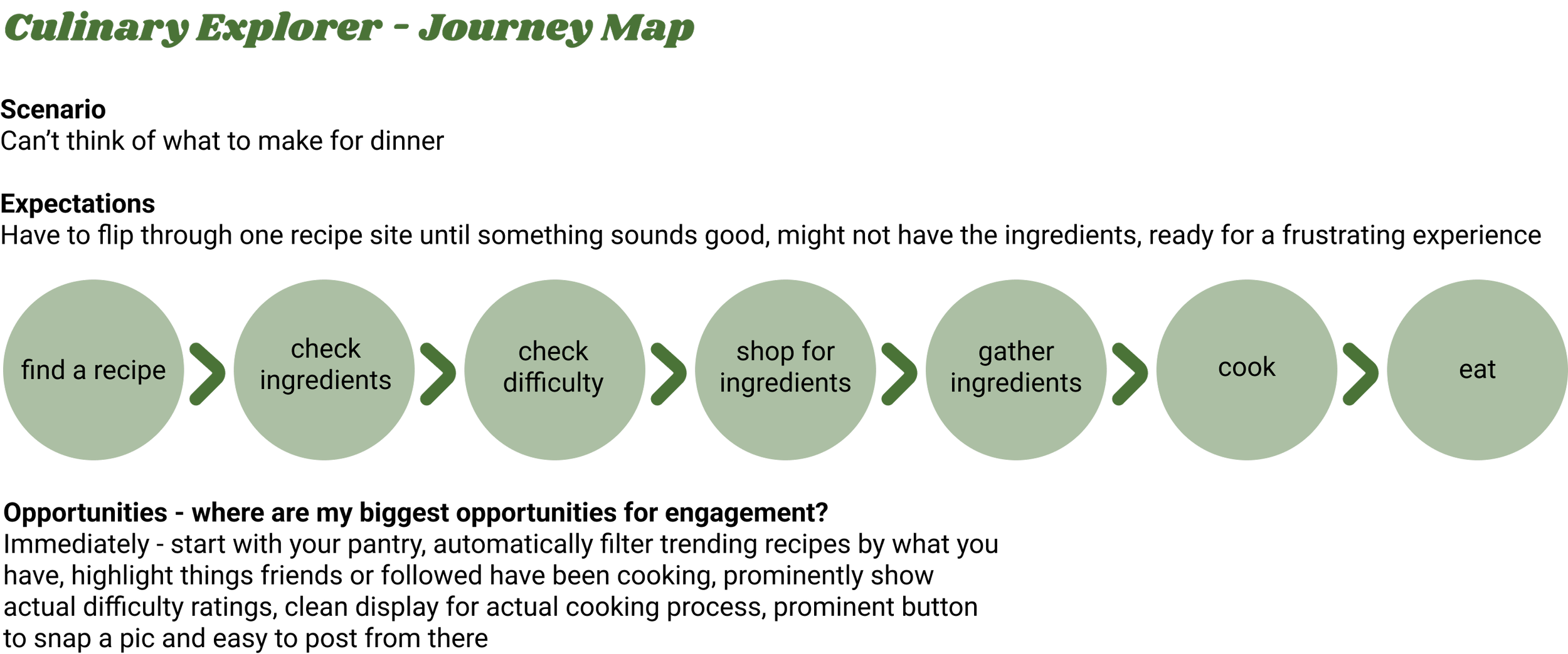
From an initial brief, I met with my client to learn more about his expectations. He shared valuable insight into his customer base — in addition to his basic requirements, he shared that his target customer, the culinary explorer:
Wants to try new things above all
Sees their phone as a cooking tool
Reads several disparate sources for food inspiration
empathy mapping
journey mapping
design remix
competitive analysis
I reviewed two apps that exemplify the two main features my client requested and selected key elements to remix:
New York Times Cooking — tiered, scrollable recipe box
Instagram — image-centered social feed with brief text
sketches
wireframes
user interviews
interview
Before jumping into tests, I asked users about how they cook and what they might look for in a recipe box app. These interviews showed that users:
Hesitate to change their grocery list behavior
Heavily prioritize tested, proven recipes
Want to filter and search by different things at different times — time limits, ingredients that go bad soon, difficulty
Prefer to scroll infinitely when exploring, over clicking
Abandon easily, especially in “exploring” behaviors
task-centered test
I asked users to complete five tasks:
Find a recipe without my app, as you would today
Save a recipe to my app
Cook using the saved recipe
Share your results
Browse and find inspiration
They were all successful, and the vast majority liked the app as a whole.
However, their challenges in navigation showed ample opportunity for improvement.
deep dive: card sorting exercise
navigation, information architecture
I did a card sorting exercise to better understand how people might group the vast array of components within the app. This exercise revealed:
Not as clear a line between “feed” and “explore” as anticipated
Social features grouped together distinctly
Group as a subset of social features, rather than recipe box
Above: visualizations of the results of the card sort
deliver
client presentation
I shared a recap of this first sprint and the MVP I had developed with the client for feedback.
I also made future sprint recommendations, should he choose to proceed with development.
Development and back-end:
Way to review and rate recipes, by link — separate from posts
Intelligent tag database — to later also grow into ingredient database
Feed algorithm — seasonal, trending, promoted
Added exploration mechanics:
Swipe-style experience, like a dating app
Personal profile — save tags you’re interested in, set dietary restrictions
Additional post types to include recommendations and a “cup of sugar” feature
Monetization through influencer and promoted recipes and/or grocery list and shopping integration
quick wins
My research revealed a few improvements I knew I could make quickly:
Fixed errors — click interactions and cancel buttons
Dialed back scope — removed ingredients, ingredient attributes and grocery/pantry lists for now
Combined Explore and Feed into one tab, created dedicated Social tab
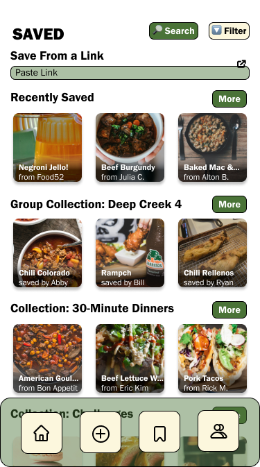
Added tags to feed and save, created option to save directly from link
Added search to feed, saved and social
visual design
I created and applied a visual brand:
Coloring: translucent, herbaceous greens and the off-white of home-written masking tape labels
Franklin Gothic font family: all one family with a sleek, readable feeling
Prominent food images with shadow effect and text overlay: prioritize the beauty of food above all
final prototype
Check out the clickable prototype for yourself or explore key pages below:
This project taught me the importance of information architecture. Given the number of moving parts in recipes and posts, I felt it was absolutely necessary to do a card sort and straighten out the flow of information before moving forward.
I also found that user priorities were crystal clear, through my interviews. They all mentioned needing appealing, trustworthy recipes, and all wanted to search by fluid attributes like time, ingredients and difficulty.
This project in particular also has a lot of potential value-added features for down the line, which I find exciting! I hope I’m able to work with this client and develop more features in the future.


