next stop
a frictionless ride — transit app with instant arrival times
Lead Designer, Thinkful UX/UI program
83.6% use their phone to navigate
50% ride 10+ times monthly
key skills: Personas, Empathy and Journey Mapping
problem: the mad dash
After recent line expansions, riders were running to the Washington & State stop for an approaching bus, only to find it wasn’t their ride. City officials requested help easing their minds.
solution: instant arrival times
I designed a transit app with arrival times at nearby and favorite stops, right on the homepage.
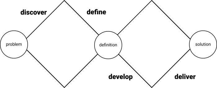
double diamond process
My process included four “D” phases: discover, define, develop and deliver. The process is iterative; learnings at every stage informed each round of changes to my design.
discover
methods
To narrow down rider priorities, pain points and opportunities to differentiate myself from other apps, I conducted:
surveys
competitive analysis
user interview
surveys
In a month, how often do you bus?
How do you rank the importance of:
I calculated a Net Promoter Score (NPS) — total 4 or 5 ratings minus total 2 or 3 ratings, shown as a percentage of total ratings.
When do you use a bus app?
main pain points
The mad dash leaves them exhausted and disappointed
Buses are late, inconsistent, crowded
Extra wait time makes them late — sometimes in bad weather
competitive analysis
CITYMAPPER
Clear navigation and notifications, but requires location information
TRANSIT
Real-time information, but difficult to search by destination
GOOGLE MAPS
Savable locations for easy trips, but no simple list of nearby stops
three major opportunities
Show the closest stop immediately
Plan for both exploration and routine trips
Design intentionally for users who refuse location services
define
methods
To explore what I learned in discovery and empathize with my users, I created:
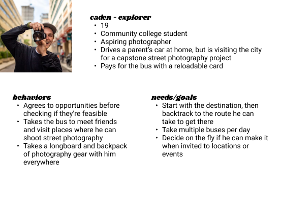
personas
empathy maps
user journey
personas
empathy maps
user journey
develop
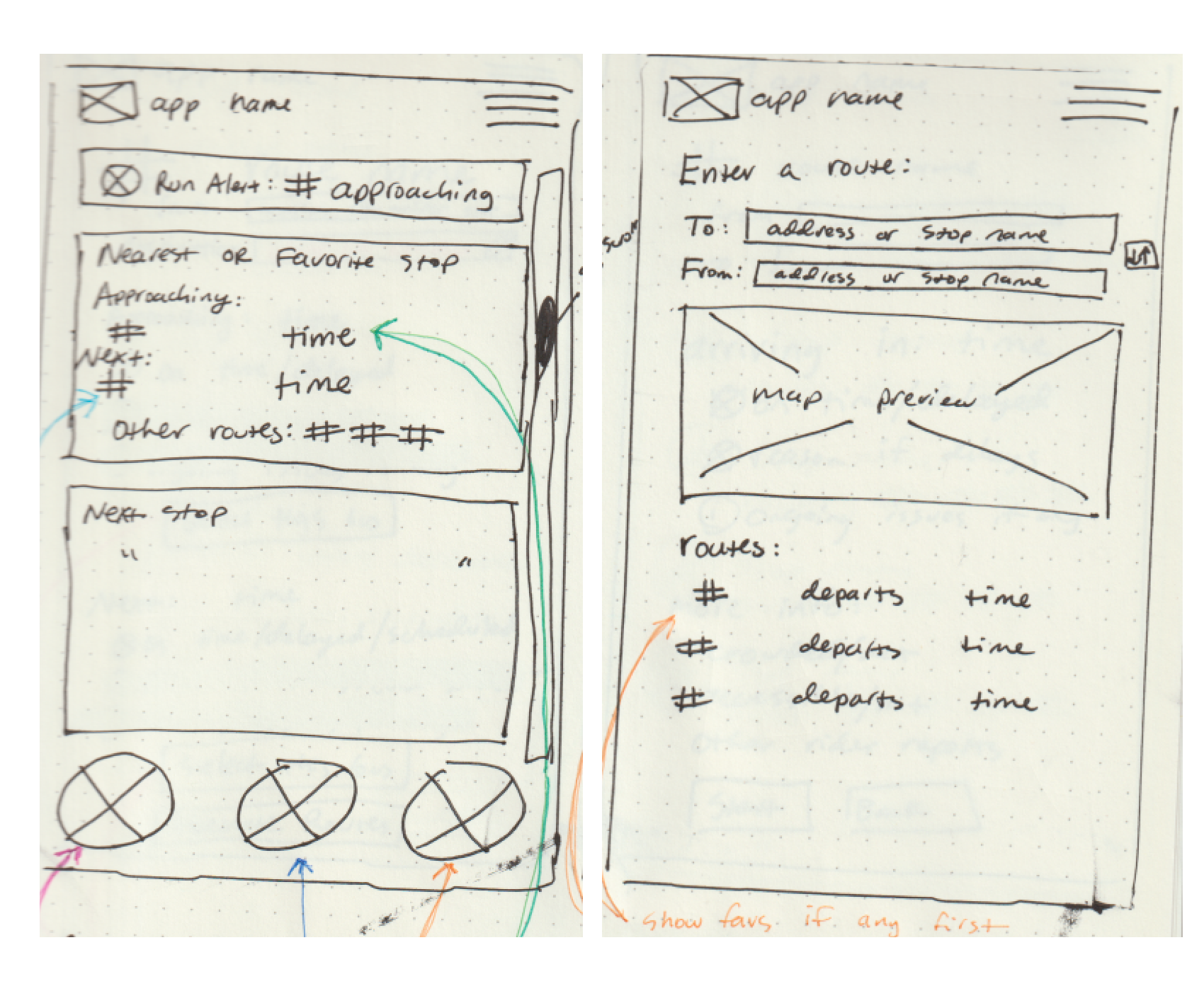
From the user flow I created sketches of each necessary screen, then turned them into wireframes, upon which I did initial user testing.
user stories, user flow
From my personas and user journey, I brainstormed and then narrowed down a set of user stories to focus on:
As a commuter, I want to know if that’s my bus approaching, so I don’t run for the wrong bus.
As a commuter, I want to see when my bus is actually coming, so I can leave the house at the right time.
As a commuter, I want to see why my bus is late or see if it might be full, so I can decide to go to a backup option.
You can see these stories represented in the user flow below.
sketches
wireframes
branding and visual design
I chose a cool, analogous palette for a sense of calm and confidence, with complementary orange for urgency. I opted for visually simple branding, with an easy to read sans serif font and a playful accent font used very sparingly. The logo is a combination of a figure hailing the bus and a navigating arrow — alongside the forward looking name “next stop” it’s meant to inspire a sense of confidence, knowledge and freedom.
deliver
user testing
I applied my branding and visual design to my prototype and ran usability testing for completion of two tasks:
Identify the approaching bus
Plan a route for a future event
Testers had a 100% success rate for both tasks, but I made some adjustments based on their feedback:
Clearly identify elements: updated iconography and fields, consistent drop shadows to indicate clickability
Use progressive disclosure: clearer headers, moved information from the trip planning screen to the route screen
Simplify: matched time entry field to To and From fields, removed duplicative alert overlay, made visual updates to match user heuristics
final prototype
Check out the clickable prototype for yourself or explore videos of common tasks:
Find arrival times immediately on the homepage; expand the route for more information.
Plan a trip, pick a route for delay information, set onboard alerts.
View stops (location information not required); save common stops, trips and routes for easy access.
I found that my user research, empathy mapping and user journeys informed my design throughout. I focused on the commuter persona — the largest portion of my surveyed users — but my user journey, user stories and user flow showed that features like trip planning solved issues for the explorer persona at the same time.
future recommendations:
Conduct more user testing to corroborate or contest my findings
Explore notifications for pre- and onboard guidance
Account for making multiple connections on the Trip and Route screens
Incorporate “last trip taken” and offer a return trip automatically
